Colourful Garden Walls & Fences
Most of us love a colourful garden, but the good news is, you don’t have to rely on just flowers…
Painting walls and features is a really simple way to brighten any garden all year.
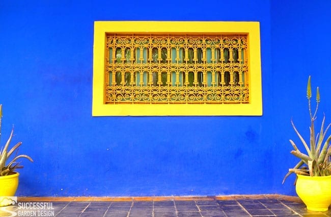
What colours should you choose to paint your garden walls and feature items?
The exact colours you paint a wall will depend on the following:
- Light intensity levels
- Surrounding architecture/ building materials
- Local planning rules
The gorgeous Moroccan blue walls of the famous Jardin Majorelle in Marrakech (pictured above*) would not work everywhere. A colour this strong needs a high light intensity. Dull, overcast skies would make the colour look oppressive, making an area feel smaller and dark.
If you love this shade of blue and don’t have a high light intensity then the safer option is to use it as an accent colour.
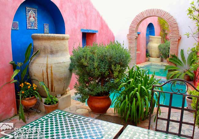
This gorgeous Moroccan inspired courtyard garden in Spain has used the blue as an accent colour. If they had painted the whole wall blue it would have dominated and made the space feel smaller. The contrast with the dusky pink, however, works well.
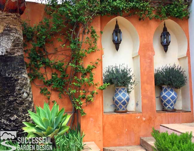
If you’re lucky enough to have an alcove in your wall then that really adds visual value. You can not only paint it a different colour to contrast but also add features, as shown above.
No alcove, no problem! You can create contrast with other objects like the chair and window frame in the image below.
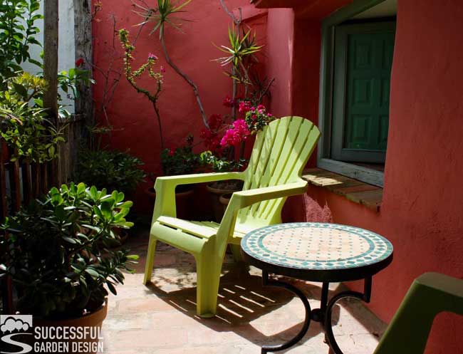
Pay attention to your planting!
One important thing to note is the planting. When you have such dominant colours in the wall, the planting needs to be sympathetic to it and not clash or be too busy. The image above shows a really successful combination, the flowers are a similar shade to the walls and the rest of the scheme is mostly green, which lets the wall do all the talking.
Choose your wall colours wisely
Make sure, above all else, that whatever colour you are painting in the garden goes with the architecture of both your house and any houses nearby. You don’t want it to stick out like a sore thumb.
By all means be adventurous, and bold, but with care! So for example, one of the hardest colours to incorporate is a vibrant purple – it screams modern, slightly ‘New Age’ – not many properties will get away with it.
Fences – outside colours have the opposite effect of inside ones
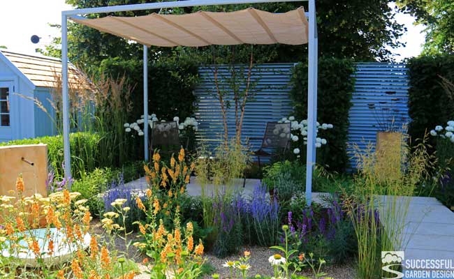
Choosing paint colours for the outside is not like choosing for inside your house. So, for example, we all know that white or magnolia makes indoor spaces look larger. Do that outside and it’ll have the opposite effect. White brings the fence in closer to you, visually. Therefore, light colours – yes that includes popular sage greens – really make you notice that fence.
Dark colours with a higher degree of black, like dark forest greens, recess into the background. Think of all those black barns we have dotted around the English countryside. They blend in beautifully. If they were painted white, they would really jump out at you!
Beware of paint!
One issue with painting fences is it will invariably end up running through to the other side unless you are very careful. So it might be an idea to discuss it with your neighbour before you get going. They might agree to paint theirs the same colour so that you won’t have to spend quite so much time and effort making sure the paint doesn’t seep to their side.
Look to nature for guidance. The Moroccan blue matches the Mediterranean and African skies and therefore looks right in those regions. The terracotta wall matches the surrounding soil of the Med region. And the pinky red also has earth tones and looks right on the uneven rendered walls, reminiscent of ancient mud homes.
If you really want something bright, like the yellow in the first garden, do it as they have, as an accent colour.
It’s all about continuity of location, materials and structural elements
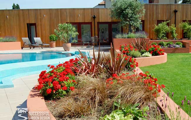
The wall in the garden above is painted the same colour as the terracotta pots and its shape mimics the swimming pool, so it ties in perfectly with the surroundings. Creating continuity with elements you add to the garden helps takes your design to the pro level.
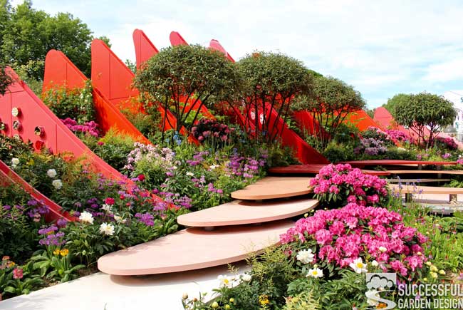
Here’s another example of continuity with colour and shape. This was a Chelsea Flower Show garden, so a little over the top, but you get the idea!
What if you’re not allowed colourful walls in your region?
There’s a little trick they use in Spain, where pretty much every Andalucian village has white walls. So instead of painting them bright colours, they do it with pots and features. Cordoba is particularly famous for its ‘patio’ gardens as they call them.
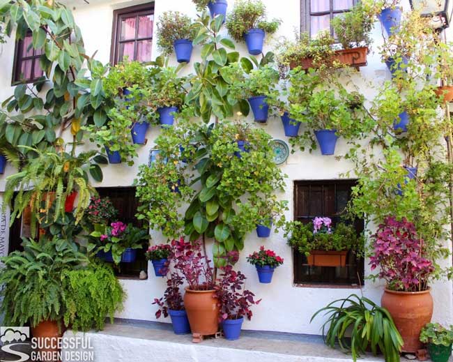
The photo above was taken in November, so it just goes to show how effective adding colour to elements other than plants is!
But beware, colour alone does not make a great garden, the design does. Colour is just the icing on the well-designed cake!
If you’d like to learn more about design, then attend one of Rachel’s free online garden design classes.

- Photo credit: the fabulous Herry Lawford (Jardin Majorelle)
- Photo Credit: Blue slat fence, the creative Karen Roe
- Chelsea Flower Show garden – Col & Tasha


