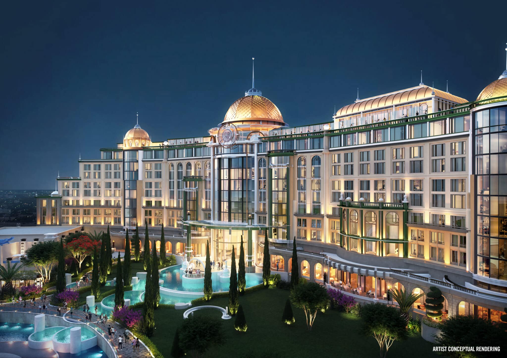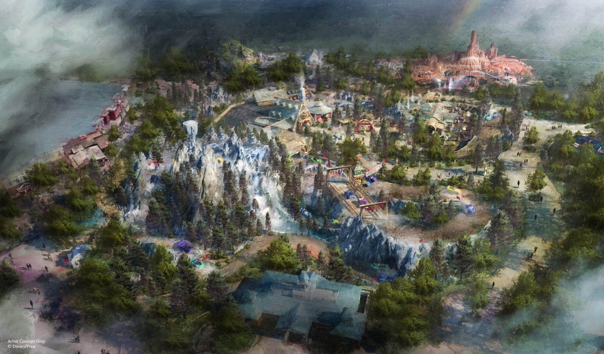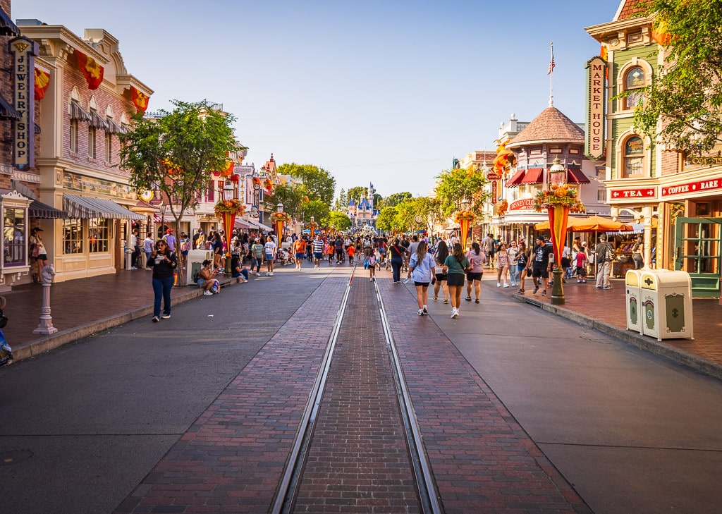
Whenever new concept art for expansions is released or a resort reimagining wraps up at Walt Disney World, fans are quick to criticize or complain, with a common refrain being that Imagineering has lost its touch, the company no longer cares about themed design, or the hotels are becoming indistinguishable from Hiltons or Marriotts. This post offers commentary in response, the extent to which we think it’s right and wrong, and underlying causes of the shifting styles at WDW resorts.
There’s no shortage of examples that illustrate this precise scenario playing out. The most recent instance came with the announcement of the DVC cabins coming to Fort Wilderness. A lot of Fort Fiends are understandably apprehensive about what Disney Vacation Club will do to the character and personality of one of the last vestiges of the Vacation Kingdom of the World.
In the last decade-plus, a lot of this criticism has revolved around DVC. Look no further than my own commentary to the announcement of Reflections – A Disney Lakeside Lodge. Mercifully, that project has been put on indefinite hold, but it’s only a matter of time before that highly-desirable (and prepped) plot of land is revisited for future development.
Then there’s the new DVC tower at Disney’s Polynesian Village Resort, which we similarly criticized and compared to something out of Holiday Inn’s exterior design portfolio. If anything, I don’t think our commentary there was negative enough, as that towering addition will irreparably alter the character and look of the Magic Kingdom monorail loop.
Then there’s Disney’s Riviera Resort. Our commentary at announcement, throughout construction, and even upon opening was critical. Our Disney’s Riviera Resort Review spills a lot of digital ink lamenting the unambitious exterior design. While I stand by all of that, I also have to admit that the resort has grown on me considerably over the last few years. The thing is, there’s a lot to dislike–but also a lot to love–about Disney’s Riviera Resort.
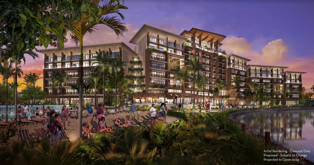
As you might notice, there’s a commonality among all of the aforementioned projects: they’re all Disney Vacation Club. That is accurate, but I’d say the pattern is more accurately among expansions of existing properties. (It just so happens that most of them are DVC, since that’s disproportionately what Disney builds now on the accommodations side.)
When you compare Walt Disney World resorts built before the mid-1990s to ones built or expanded upon in the last few years, there’s generally a clear division. The exteriors of current projects are often interchangeable with real world Holiday Inns or other mid-tier chained brand hotels.
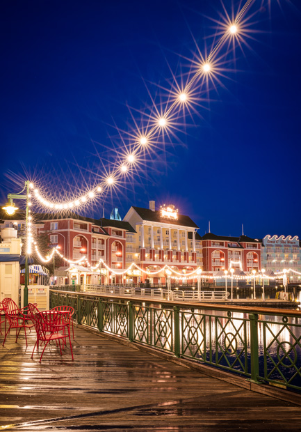
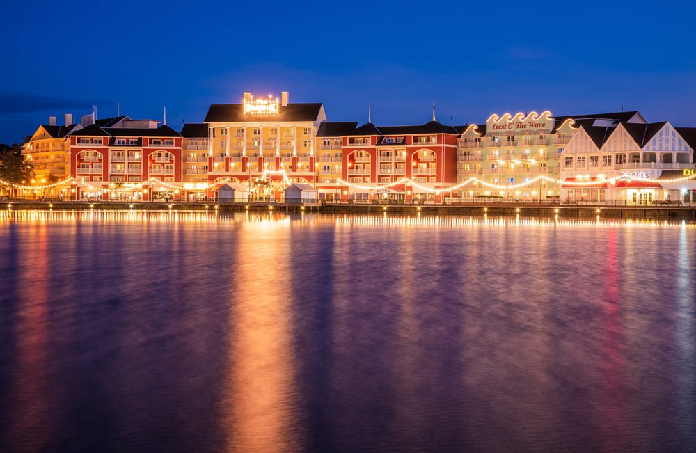
Walk around Crescent Lake and look at the facades of these resorts. They’re brimming with detail, texture, ornamentation, charm and whimsy. The exterior surfaces alone are a sharp contrast to the new casino tower at Coronado or the Fairfield Inn Des Moines Airport Riviera Resort. There simply is not the same depth of detail in the designs with new builds at Walt Disney World. The exteriors are largely unthemed; at best, they are decorated with a minimal amount of flourishes to blunt their boxiness.
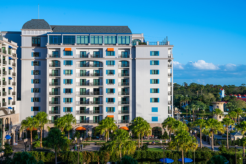
One explanation for this is that Disney simply doesn’t want to spend on themed architecture, which eats into profit margins on Disney Vacation Club sales. This makes sense, and also explains why Disney is adding these towers alongside existing resorts rather than making them standalone properties. By building adjacent to current hotels, they can share infrastructure or don’t need to offer every amenity on-site.
This is completely understandable, and there are also upsides for guests in expanding at existing resorts. I’m not entirely unreasonable about development at Walt Disney World, I just think it needs to be done in a sustainable way, and one that’s respectful of and consistent with what already exists. That’s my big criticism of Gran Destino Tower, Disney’s Riviera Resort, Reflections Lakeside Lodge, or the upcoming Polynesian tower. All of those look nothing like their surroundings–they stick out like sore thumbs.
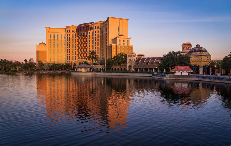
As much disdain as I have for the exterior appearance of Gran Destino and the Riviera, it’s also only appropriate to point out that both are excellent resorts if all you care about is their substantive offerings and view them only from the inside, or in isolation. To be fair, that may be the case for many fans and most casual consumers and hotel clientele.
The outside appearance of Four Seasons Orlando isn’t exactly anything special, but it’s a great hotel on the inside. The critical distinction is that Four Seasons is known for superlative service, not Disney design–and the Four Seasons didn’t impact the existing ‘skyline’ of Walt Disney World when built. (In fact, there are many world-class luxury hotels that come in absolutely boring and dull packages. All-encompassing themed design is one of the distinctions between those and Walt Disney World resorts.)
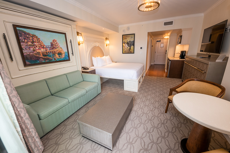
For all of my complaints about Disney’s Riviera Resort, the guest rooms were never among those. These guest rooms do a great job of balancing competing interests, and are simultaneously luxurious, modern, and themed. Achieving this trifecta is exceedingly difficult, and an area where Disney struggled pre-Riviera. The room reimaginings pre-2019 reflect this–the track record is hit or miss, especially with anything done in 2014-2018.
Post-Riviera, Walt Disney World has been mostly crushing it with room reimaginings. (For me, the Contemporary is the lone exception to this–but some people seem to love those rooms.) The current ‘wave’ of innovative accommodations that marry space-saving styles with well-themed ones is perfect. These offer an array of upgrades to both the form and function of the rooms, with little of value lost in the process.
Compare the new rooms at Boulder Ridge with those only a few years earlier at Copper Creek–the former are far superior to the latter in every conceivable way. The contrast is even more stark when you look back at the last rooms at the BoardWalk or Beach Club Villas with the newest ones. Grand Floridian is currently in the process of “undoing” its mid-tier Marriott style rooms and replacing them with what we’d consider some of the best rooms at Walt Disney World.
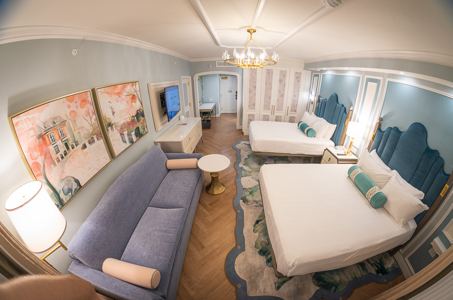
We’ve shared this sentiment in a number of room reviews and photo tours, and it’s always met with a mix of fan agreement and disagreement. That’s understandable, as style is a matter of personal preference and tastes, and there’s never going to be complete consensus. Even with rooms we like, it’s possible to concede certain points: some rooms look too sterile, flooring can be loud, there’s less charm, and so forth. And of course, the lack of bed runners–who cares how unsanitary they might be!–really makes the designs feel incomplete.
While conceding some of that, it’s difficult not to wonder the degree to which nostalgia and sentimentality is clouding objectivity. We also very much “get” this, and have fondness and memories around a lot of little things at Walt Disney World. I’m not going to give examples that could be used against me in the future, but I know I have irrational passion and love for certain things at Walt Disney World that are unpopular with current guests.
The same could probably be said for other fans and old room designs. I’m sorry, but the 1990s and 2000s styles of so many resorts did not age well. Many of those are loud, garish, and would (rightly) be criticized by casual guests as looking like grandma’s guest room. It’s possible to personally love them for the memories they hold and still admit that. Being able to recognize and hold conflicting feelings is a good skill.
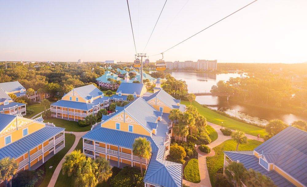
Beyond that, there are also differences between the preferences of diehard Walt Disney World fans and casual guests. Often, these align–but definitely not always. One easy example is resort layouts. Many fans love the sprawling style of Port Orleans, Caribbean Beach, or the Value Resorts. (I am one of these “many fans.” There are few things I enjoy more than wandering, exploring, and soaking up atmosphere. It honestly saddens me that more people don’t appreciate this, because this ‘blessing of size’ is so uncommon at real world hotels.)
By and large, regular guests hate this. It is one of the most common complaints about these resorts, and has negatively impacted satisfaction scores and the likelihood of revisiting or recommending a particular property. It’s not the only reason (see above about shared infrastructure costs), but it’s a big contributing factor in Disney’s decision to consolidate Caribbean Beach and Coronado Springs while adding towers to their grounds. It’s also one big reason why I’d be surprised if Walt Disney World returns to the sprawling style of those resorts anytime soon.
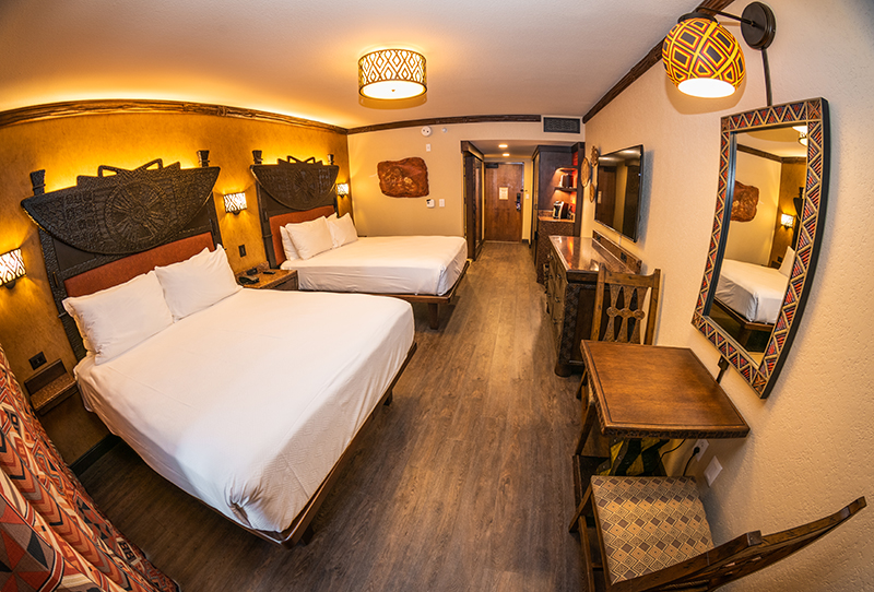
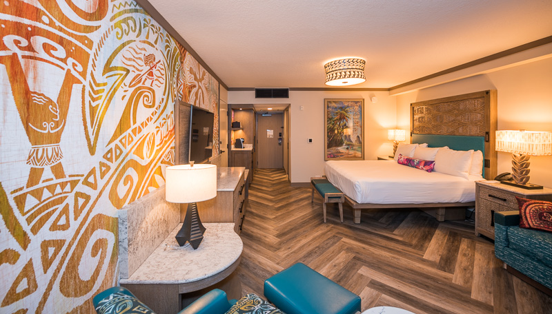
The same is true in guest rooms. Diehard Walt Disney World fans love thoroughly-themed rooms, with many favoring a ‘more is more’ stylistic philosophy. Many of us want to see transportive themes executed in clever ways; resorts that take us to another time and place are beloved even if “lacking” in-your-face characters from Moana or The Incredibles.
By contrast, a majority of casual visitors crave characters, convenience, and/or luxury. They want the high prices of resort rooms to be apparent via fresh designs and well-appointed accommodations. To many of them, “distinctly Disney” means intellectual property, not a transportive theme.
None of this is particularly speculative or theoretical. These are the conclusions reached when evaluating responses to test room concepts and guest feedback. It should go without saying, but these are generalizations and not definitive across-the-board. It’s also fair to point out that guests cannot give feedback on what they are not shown; you don’t know what you’re missing out on if you never see or experience it. You don’t know what you don’t know!
This is also not to give Disney a pass on everything, hand-waving away any lackluster designs because “they must be what guests want!” I don’t believe that for a second. There are plenty of projects at Walt Disney World that have bad outcomes by almost any reasonable metric. No amount of excuses or attempts to explain that away pass muster.
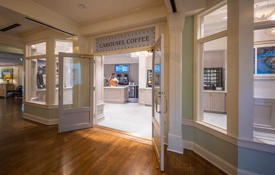
Take Carousel Coffee, the new dining location that replaced the gift shop in the lobby of BoardWalk Inn, for example. Literally no one asked for this style. There weren’t guest satisfaction surveys suggesting that what people really want is the generic “style” of cookie-cutter big box hotels. (Seriously, this is virtually indistinguishable from the look of the lobbies at the new Flamingo Crossings extended stay hotels.)
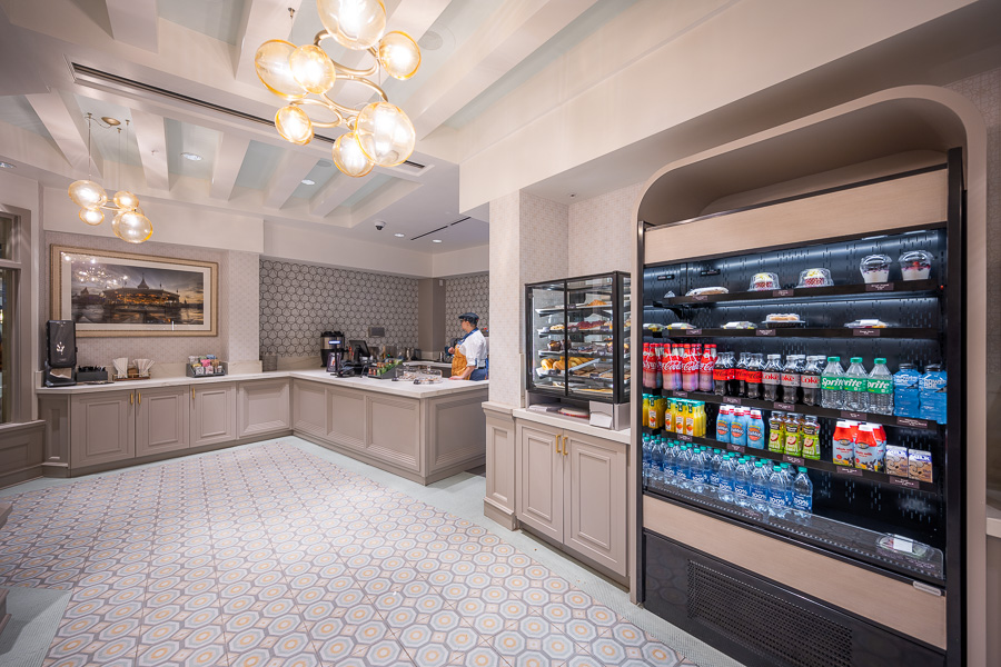
I don’t know what the explanation is for Carousel Coffee, but it isn’t a good one. One possibility is that it was a quick project with minimal (or no) involvement from Imagineering. Another is that it had an incredibly limited budget, and not enough resources were allocated to turn this into anything better or more ambitious.
It’s also possible that there was meddling from non-creatives who don’t “get” what makes BoardWalk Inn special, or what its theme even is. They could have looked at guest feedback about the hotel feeling dated, and drawn the erroneous conclusion that this is the solution to fixing that and giving people what they want. (It isn’t.)
Personally, my suspicion here (with absolutely nothing to back this up) is that it’s all of the above with the bungled outcome at Carousel Coffee. I just don’t want to live in a world where someone–anyone–thought this design should’ve seen the light of day at a Deluxe Resort themed to turn-of-the-century Atlantic City.
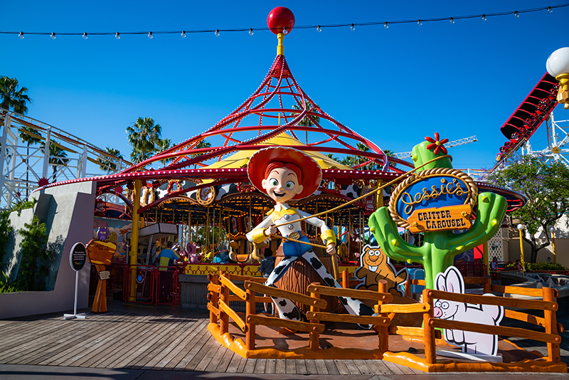
There is also the possibility of creative failure. Many fans don’t want to believe this, and instead blame the beancounters or whatever other boogeyman, but Imagineering is not infallible. Not everyone at WDI has the same skills, and not all projects get assigned top-tier Imagineers. Even when resources have been properly allocated, creatives have been responsible for duds over the years.
It’s difficult to give “pure” examples of this, as there’s usually not a simple and straightforward explanation. (Even with projects that are well-done as a whole, there are misfires or instances of too few checks on the worst impulses of creatives.) With that said, the project that best comes to mind here is the reimagining of Pixar Pier. Although this was a pet project that got pushed through, it was also a creative failure with a ton of money spent on what can best be characterized as a lateral move. (I would not be that charitable with it.)
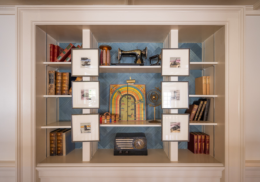
With all of that said, I also see too many hyper-critical fan responses to projects like the inarguably-bad Carousel Coffee or the more subjective room reimaginings. These reactions often entail sweeping generalizations about how Walt Disney World doesn’t care anymore or do things right anymore, Imagineering doesn’t have the talent to do “good” design anymore, among many other damning accusations. Thankfully, they’re also completely inaccurate.
I’ll be the first to say that I think there’s an issue with resource allocation at Walt Disney World. Certain projects cost absurd amounts of money, while other pressing issues are outright ignored. That is a real issue, but one I’ll save for another post and another day. Regardless, the number of ambitious, successful, big-budget, and creative projects at Walt Disney World entirely defeat these arguments. The great stuff raises the bar for everything else, and it also defeats the argument that Disney has lost its touch.
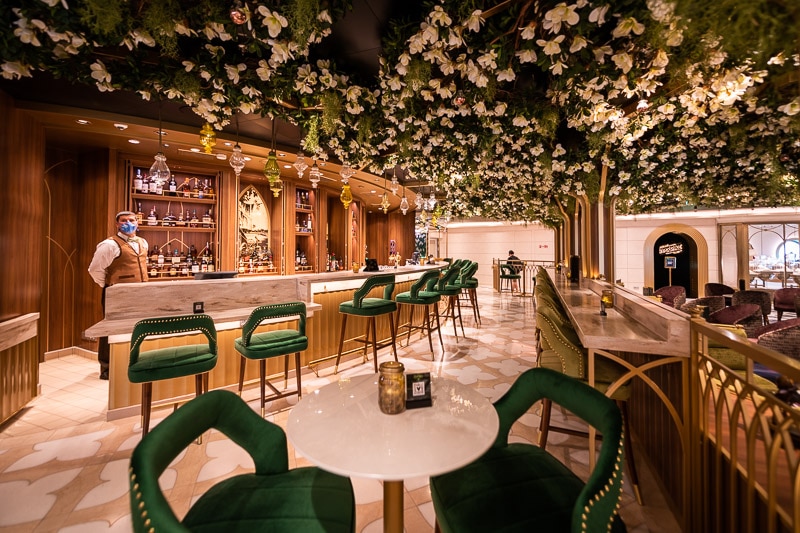
Heck, it’s possible to look at individual components of the same project and see outcomes of vastly different quality. Since we’re talking largely about design, a good example here is the new Disney Wish. Although it’s a cruise ship, that’s more or less ‘resort-adjacent’ and there’s a lot of overlap between the two. Aboard the Disney Wish, there are truly stunning spaces; thematic exemplars that were lovingly and expertly designed. There are also some real headscratchers that feel like they were thrown together in 15 minutes while browsing the clearance section of Wayfair.
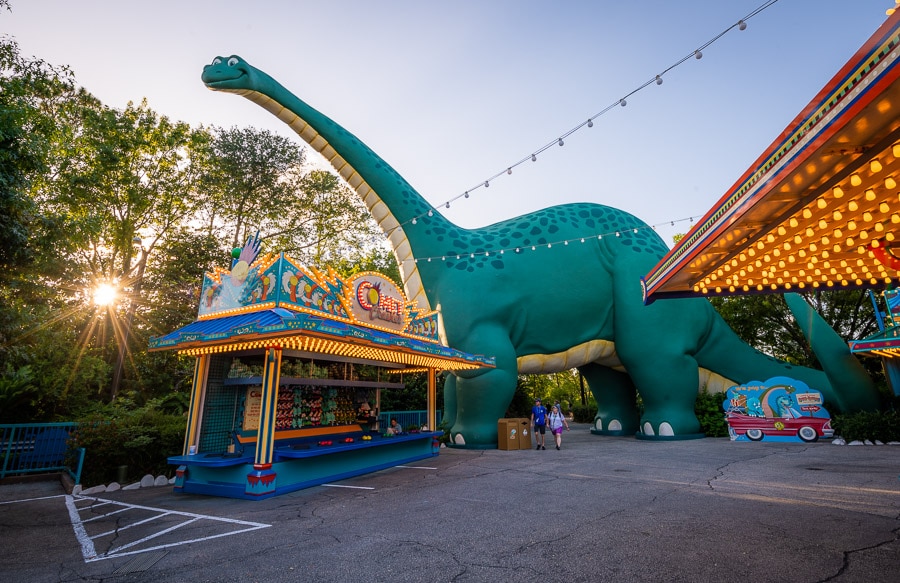
Of course, this also exists in the theme parks. If viewing each in isolation, would anyone believe that Pandora and Dino-Rama are products of the same theme park, company…or even universe?! (These two lands are Exhibits A and B in the case of “Not Everything Done by Disney in the 1990s Was Good, and Not Everything in the 2010s Was Bad.”)
To that point, it’s disingenuous to pretend that everything from the past was good and everything from the present is bad. The fanbase is more connected now, dishing out immediate hot takes on everything–and often, the more sensational opinions are rewarded with the most reach. Back in the day, fans learned about new things via books published annually or upon seeing or experiencing them firsthand when they visited the parks. (And I don’t know about you, but I’m far more forgiving of things in person when ‘immersed in the magic’ than when sitting at my keyboard.)
Missteps were fixed and course-corrections were made with minimal fanfare. (Minus Dino-Rama, which continues to limp along for reasons unknown–possibly to torture me.) You can scour YouTube or ‘extinct Disney’ pages and readily find examples of things from the 1980s and 1990s that would be absolutely eviscerated by the fandom if they debuted today. But again, these shifting standards and rose-colored glasses through which we view Disney’s past are probably better addressed in a dedicated post.
Ultimately, that’s where I come down on these arguments about resort reimaginings, redesigns, expansion plans, and themed design trends at the resorts of Walt Disney World. This doesn’t come down strongly on either “side” or contain any definitive conclusions because there aren’t any; it’s more case-by-case, circumstantial, and complicated.
That leads to rambling commentary like this, which probably won’t satisfy anyone who has been part of these seemingly endless debates. Perhaps I should’ve instead dedicated a couple thousand words to how the travesty that is Carousel Coffee represents the creative collapse of Walt Disney World (it doesn’t) or how the recently-reimagined resort rooms are great and the haters have it all wrong (we’re not here to stifle dissent; constructive criticism and feedback about personal preferences is always good!).
In the end, I think it’s good to hold Walt Disney World to high standards. It’s also fair to say that themed design and immersive environments are of paramount importance, and should be the calling card of Imagineering. Chasing contemporary design trends is a fool’s errand, and one that’ll always result in datedness. (Look no further than all of the “rustic hipsters move into an old barn and find some eclectic decor on clearance at Anthropologie” interiors at Disney Springs that look tired less than a decade later.)
Disney obviously must be cognizant of guest preferences and industry trends–especially when it comes to comfort, convenience, and functionality. However, there are also good reasons why Walt Disney World has developed such an ardent fan-following over the last 50+ years and Imagineering is a beloved institution–but other firms producing cookie-cutter designs are not household names. Pushing the envelope and giving guests things they never knew they wanted or needed is a key to success, whereas settling for “good enough” is a recipe for similar responses from guests.
Planning a Walt Disney World trip? Learn about hotels on our Walt Disney World Hotels Reviews page. For where to eat, read our Walt Disney World Restaurant Reviews. To save money on tickets or determine which type to buy, read our Tips for Saving Money on Walt Disney World Tickets post. Our What to Pack for Disney Trips post takes a unique look at clever items to take. For what to do and when to do it, our Walt Disney World Ride Guides will help. For comprehensive advice, the best place to start is our Walt Disney World Trip Planning Guide for everything you need to know!
Your Thoughts
What do you think of recent resort reimaginings, expansion, and other design projects at Walt Disney World? Is there a clearly good or bad trajectory, or is it more case-by-case with a mix of high and low quality outcomes? Any other thoughts or feedback to add? Do you agree or disagree with our assessment? Any questions we can help you answer? Hearing your feedback—even when you disagree with us—is both interesting to us and helpful to other readers, so please share your thoughts below in the comments!


